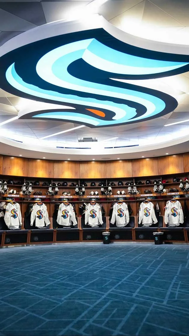
Client: Seattle Kraken
My Role: Art Direction and Design
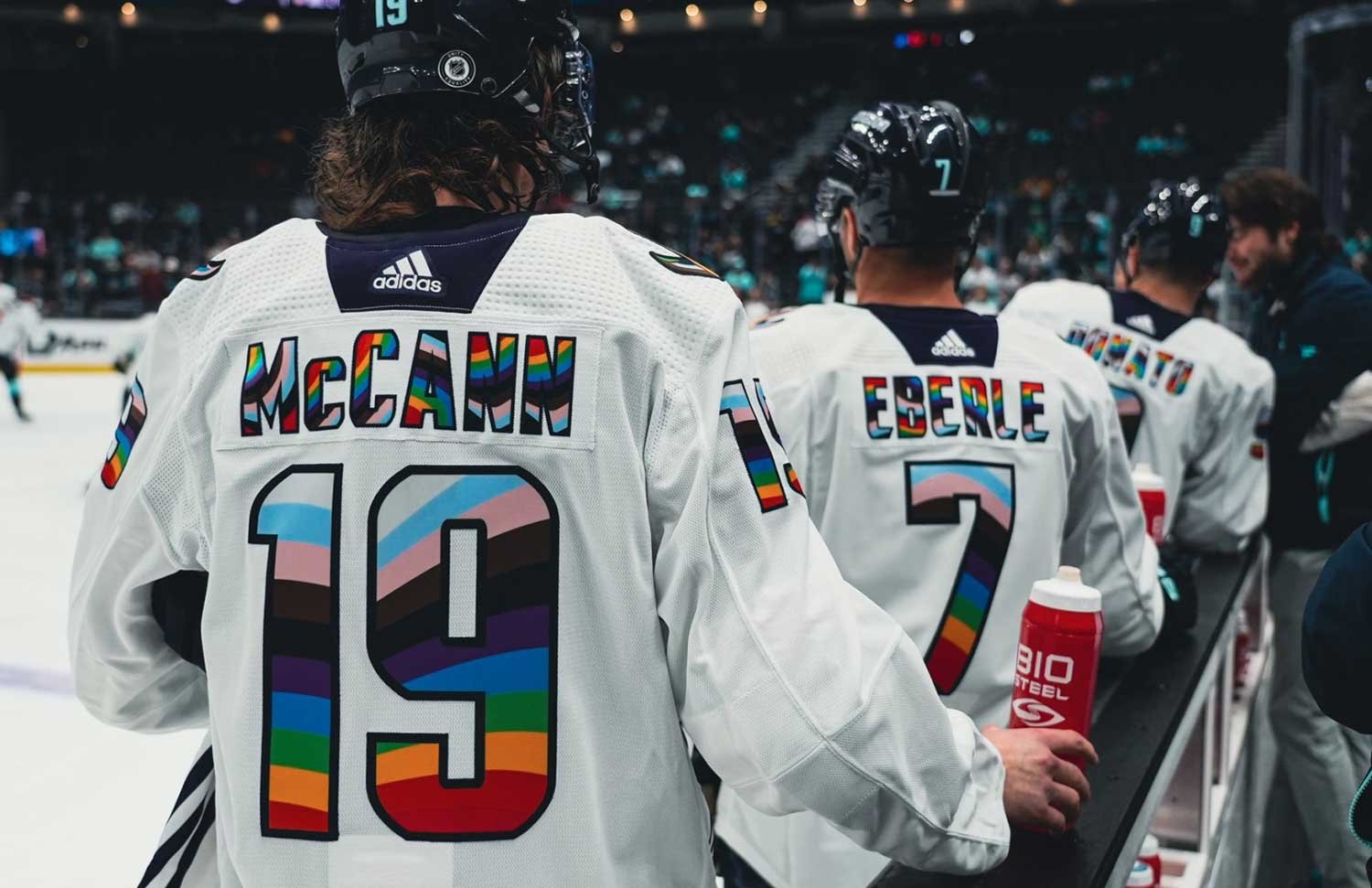
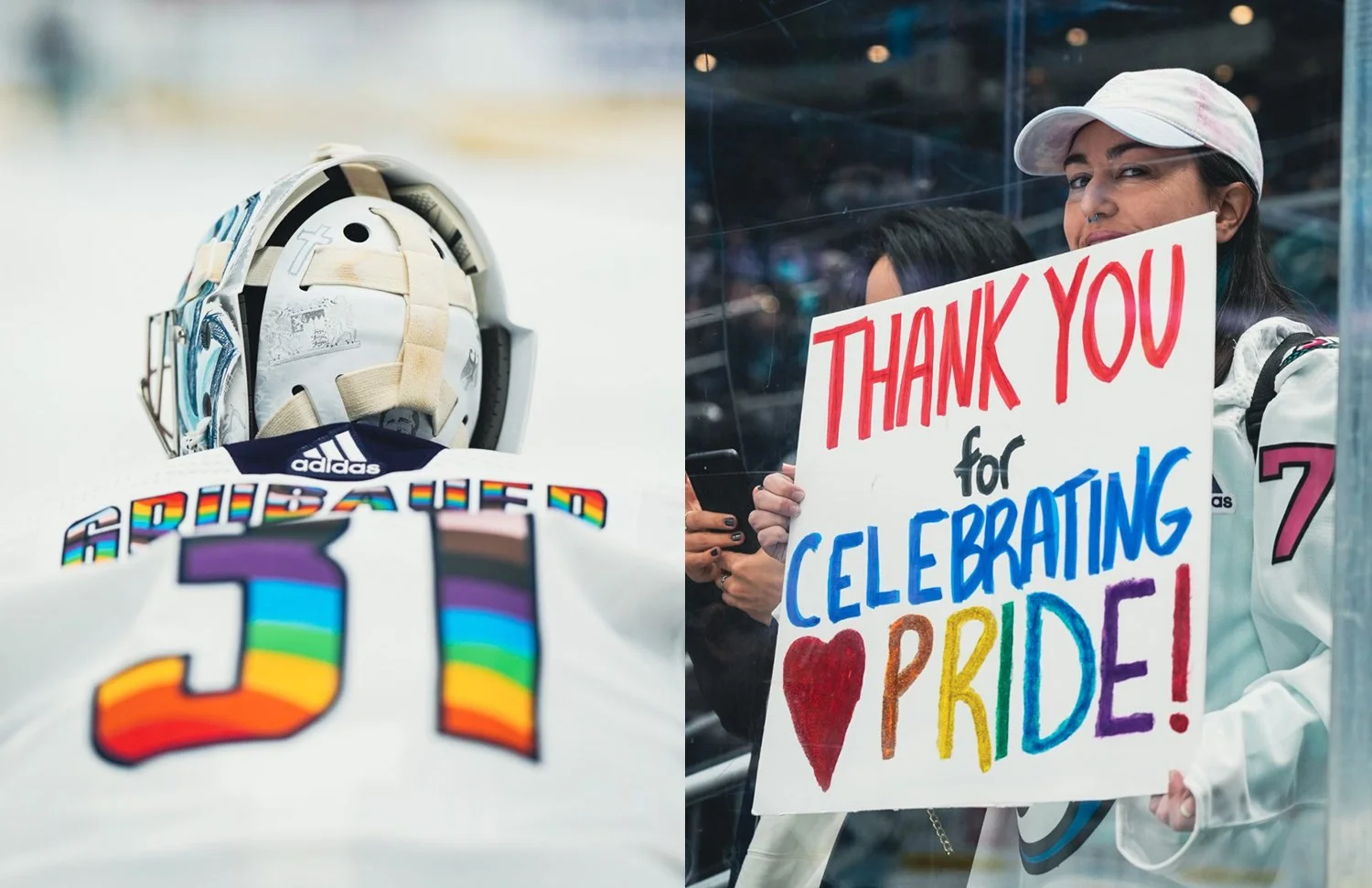
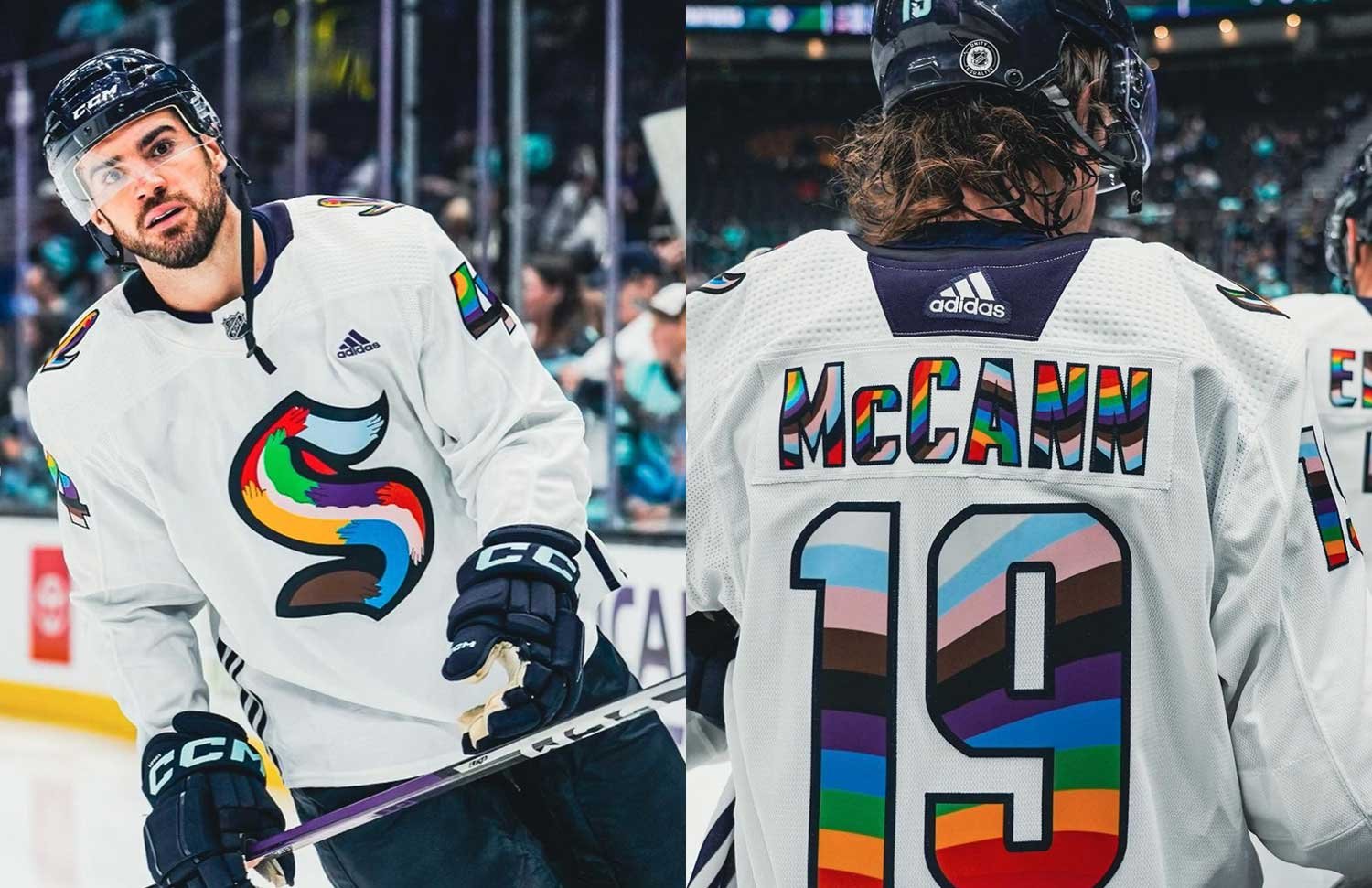
I was grateful to be invited to design a Pride warm-up jersey for the Seattle Kraken. The project is a quiet celebration of love, identity, and belonging on and off the ice. It’s more than a jersey. It’s a reminder that everyone deserves to feel seen and welcome in the game.
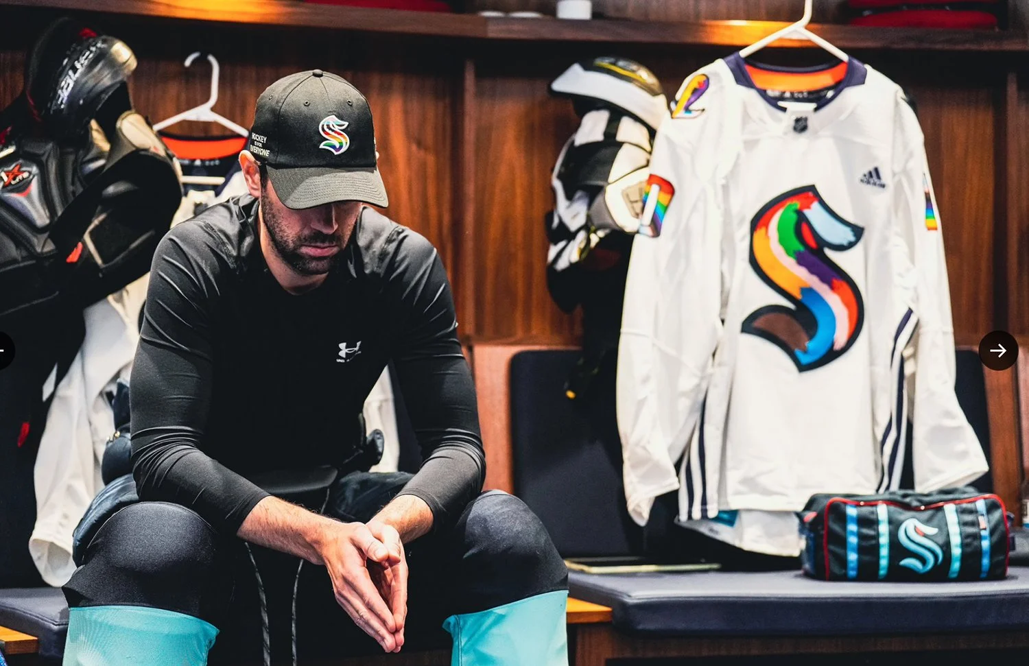
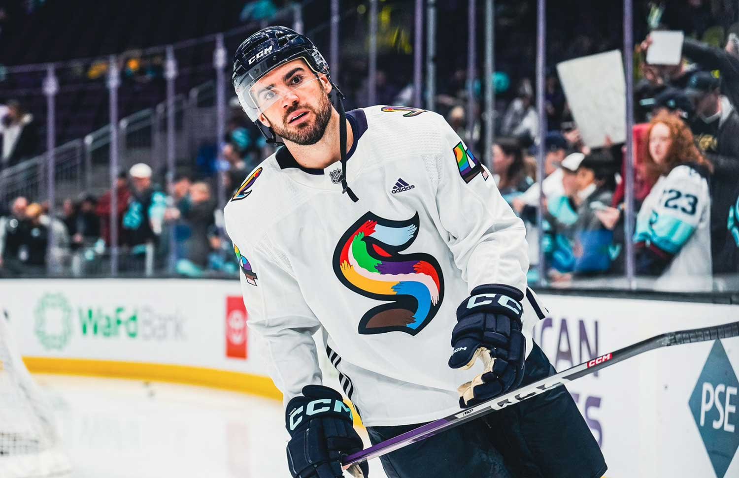
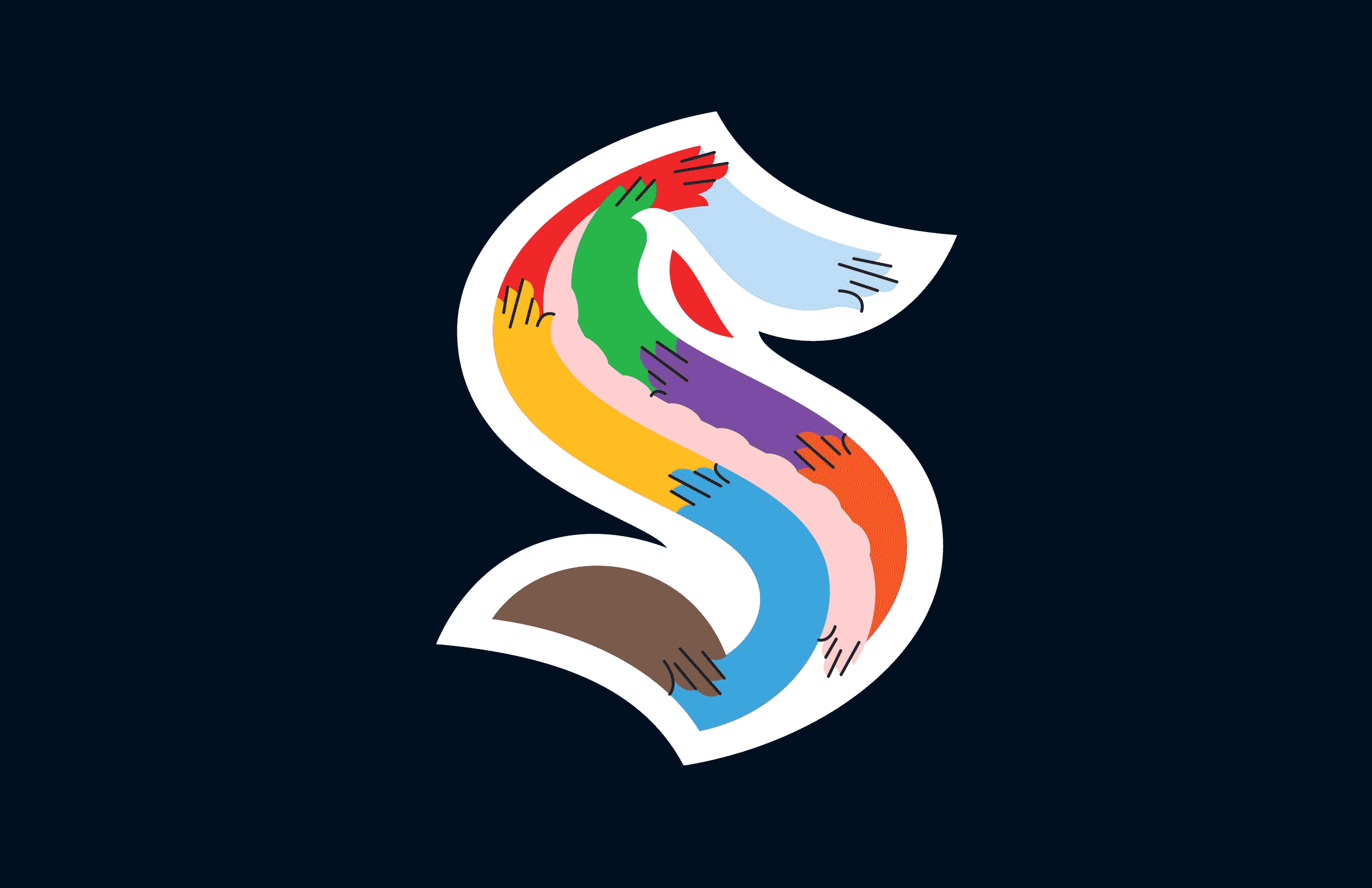
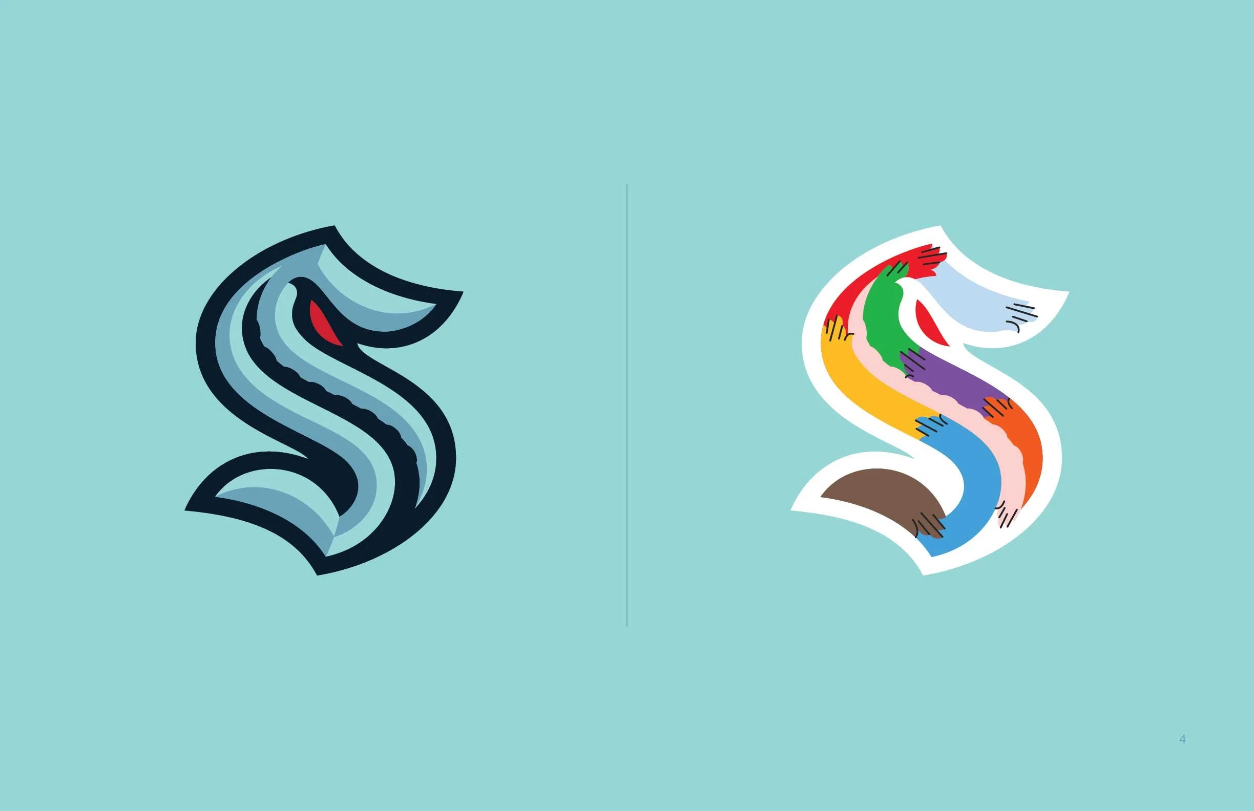
Primary Crest
—
The crest is a symbol of allyship, togetherness, and belonging to the LGBTQIA+ community.
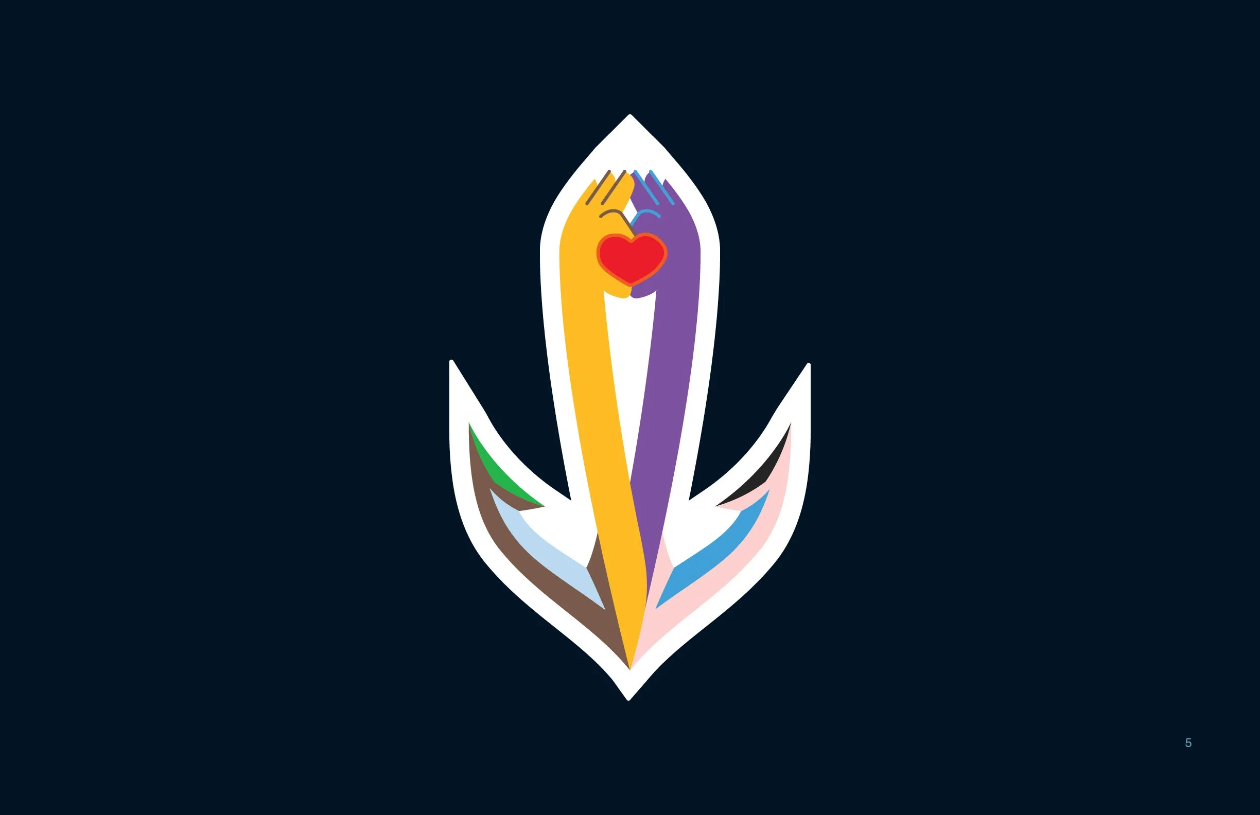
Secondary Crest
—
The secondary crest is a symbol of Seattle Kraken’s commitment to drive positive social change and to foster more inclusive communities through the game of hockey.
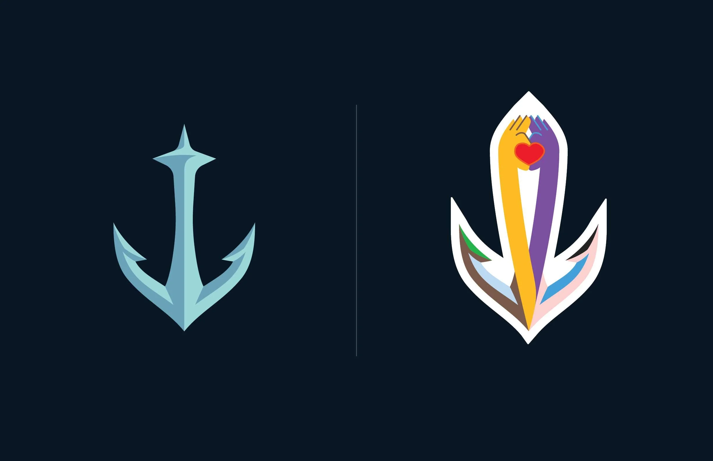
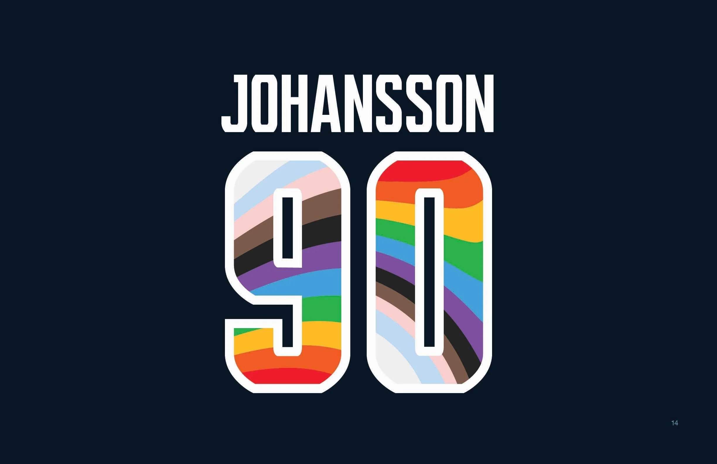
PRIDE Colors
—
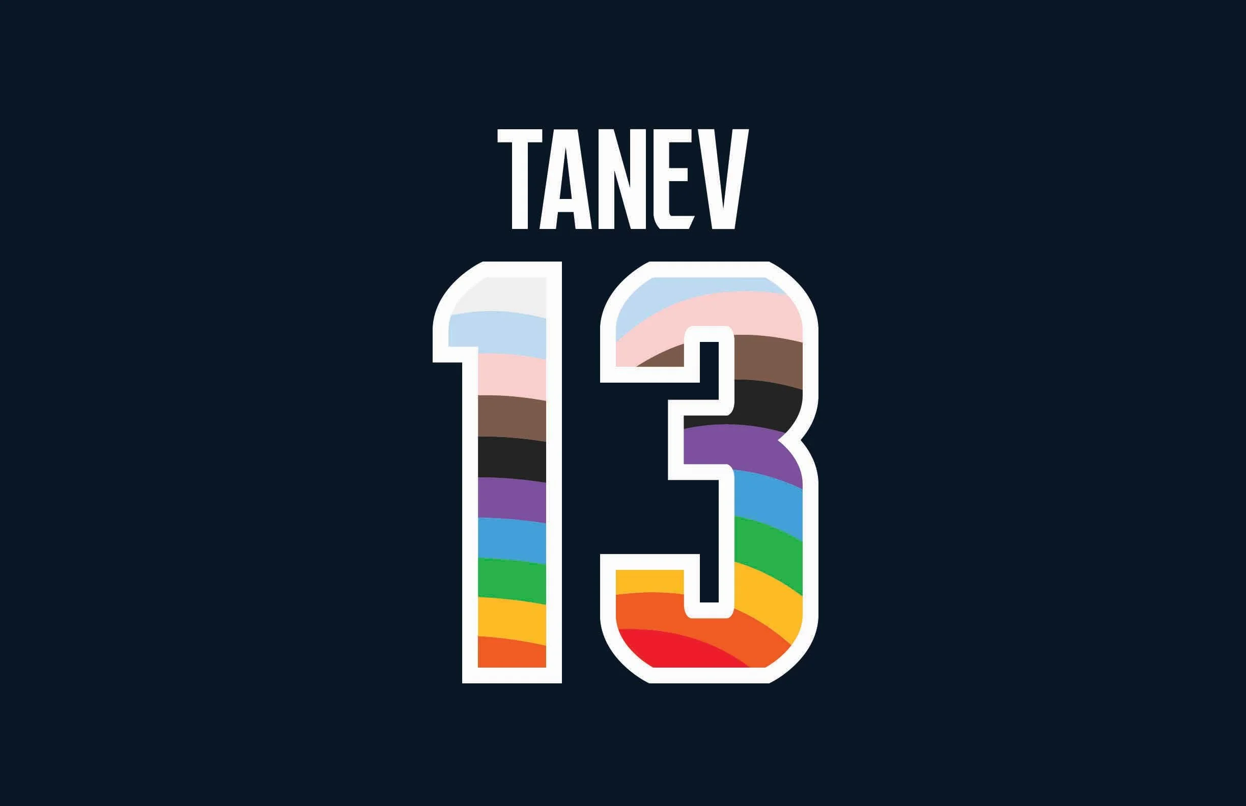
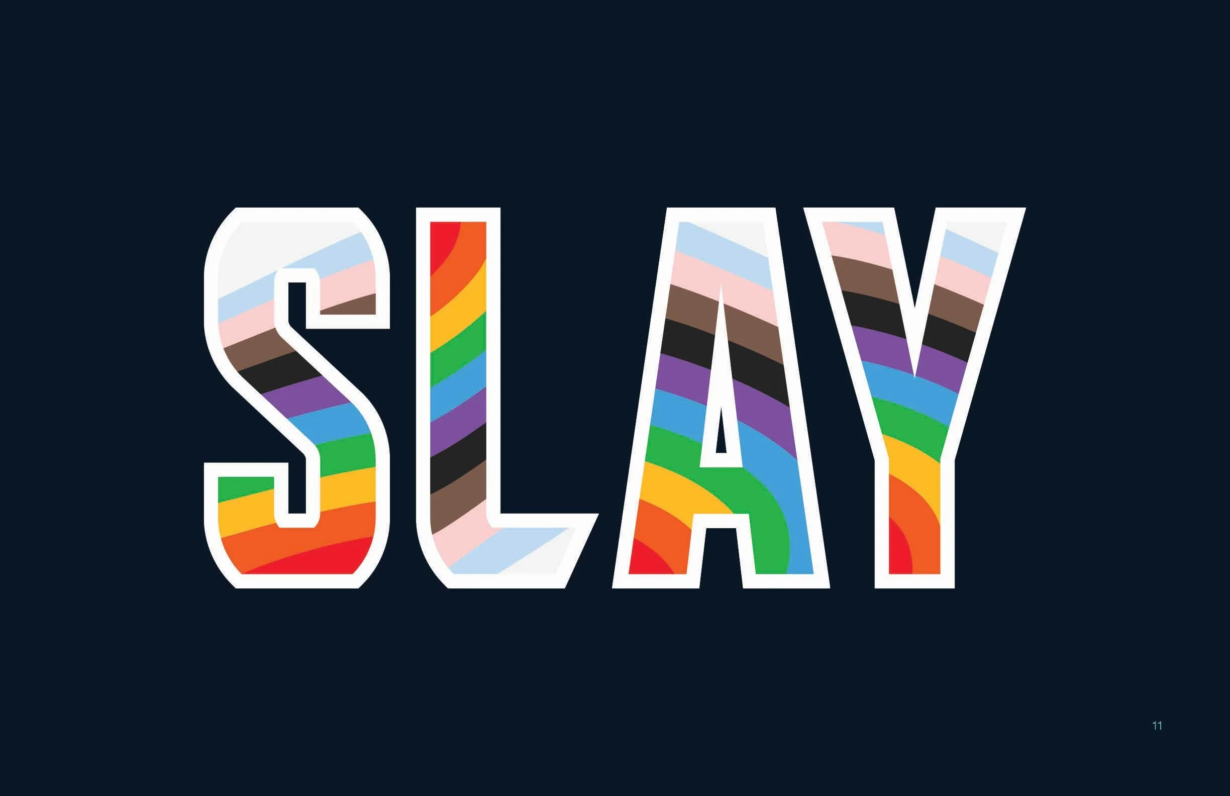
Inspired by the Progress Pride Flag designed by Daniel Quasar—black, brown, pink, light blue, and white are included to represent the experiences of people of color, as well as representing people who identify as transgender, gender nonconforming (GNC) and/or undefined.